We’re excited to announce that PowerRFP has had it’s interface refreshed to help facilitate an easier workflow for increased productivity.
At our core, PowerRFP is designed to make the creation and management of RFP easier for small businesses – and this is exactly what our updated interface aims to do.
New Changes include:
- Updated dashboard
- Updated Creation/Edit interface
- Updated Evaluation interface
- Updated Response interface
Let’s go over each change in detail
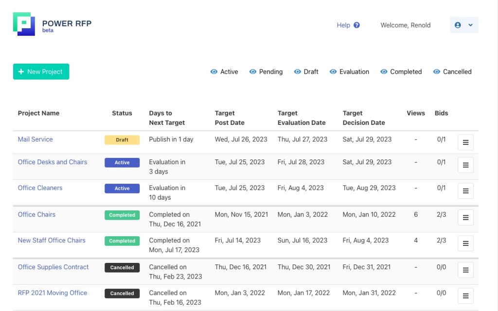
Dashboard
The dashboard has been updated to help with the organization of your RFP projects.
Previously, the dashboard was separated into tabs by limited project status. Now, the dashboard has been modified with user experience in mind. Instead of projects being separated by Current Projects, Completed Projects, and Cancelled Projects, it is centralized. We have expanded the project status to include more options and added a filter feature so you can hide or view select projects of the users choosing.
Additionally, completed and cancelled projects are hidden by default to not clutter up the interface. Further, Draft, Pending Active and Evaluation projects are now all organized by the next important date. This makes it really easy for users to see what projects have upcoming actions.
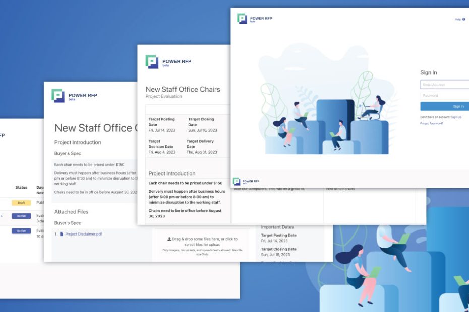
Project Creation
Creating an RFP has always been time-consuming. This is why we have streamlined the RPF Project interface.
The new interface is more compact and easier to enter information. The previous layout was very linear and did not take advantage of larger screens. With the new interface, fields are laid out in a column grid to maximize the view and make it easier for users to navigate.
Watch the tour
Evaluation screen
Evaluating bids is one of the most important aspects of your RPF Process. The new Evaluation interface makes it easier for small businesses to quickly review the results of the submissions.
Similar to the previous version, the updated interface features side-by-side answer comparisons. However, the updated interface reduces the white space in the header to allow for more visibility of the RFP answers.
Additionally, the company name and the questions are “fixed” for scrolling – similar to an Excel sheet with the first row and column fixed. This way, users will always be able to see the company name, the RPQ question and the response.
New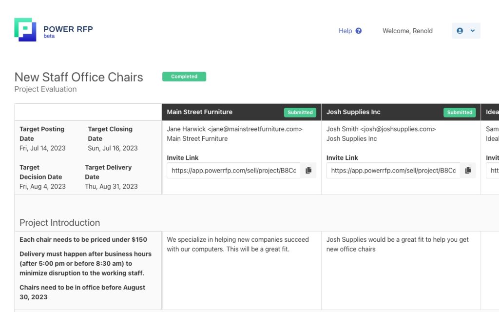
Previous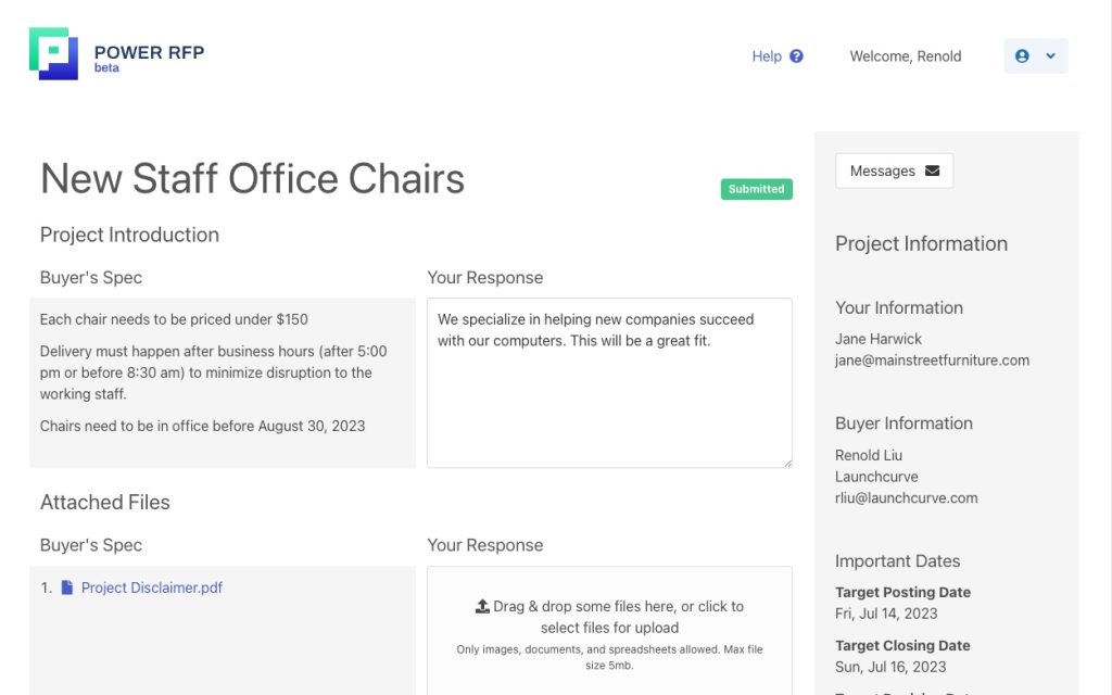
Vendor Submission Screen
This series of workflow updates extend beyond the buyer side and into the vendor side.
Previously, the vendor needed to scroll to review important dates and engage with the messaging functions.
Now, on the RFP Submission screen, vendors now have all important dates and messaging functions on the sidebar. This ensures that the vendor will have all the information they need to properly fill in your RFP, and should they have questions, they can easily contact you.
Try it out!
We’re excited to bring these changes to PowerRFP. Our goal is to make creating, filling out and managing RFPs as easy as possible. And with these new workflows and layouts, we feel we are going in the correct direction.
Log in and take a look! Or if you haven’t tried it yet. Sign-up today to try it out for your next procurement project today!